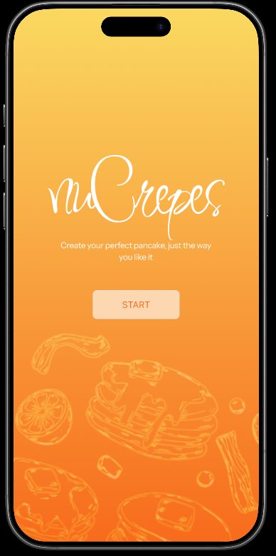
nuCrepes
Custom pancake-ordering mobile app prototype
An interactive mobile app prototype designed entirely in Figma, where users build their perfect pancake from scratch — choosing batter, fillings, and toppings — or order from curated recommendations. Focused on a warm, food-friendly aesthetic with playful illustrations, smooth navigation flows, and a frictionless checkout experience.
SCREENS
KEY FLOWS & FEATURES
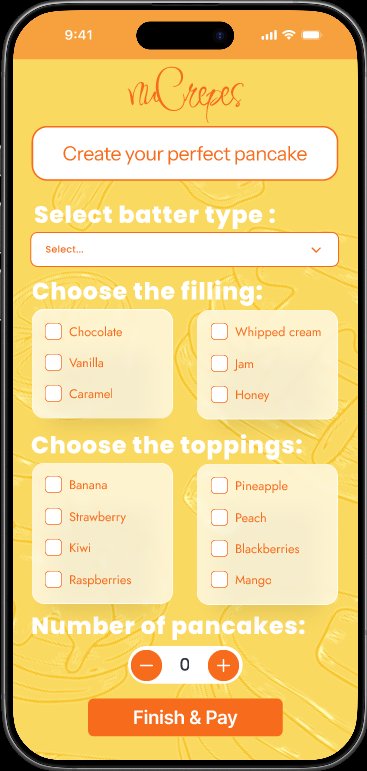
Custom Pancake Builder
Step-by-step flow: pick batter type, choose up to 3 fillings, layer with toppings, set quantity. Every choice is visualised with playful illustrations.
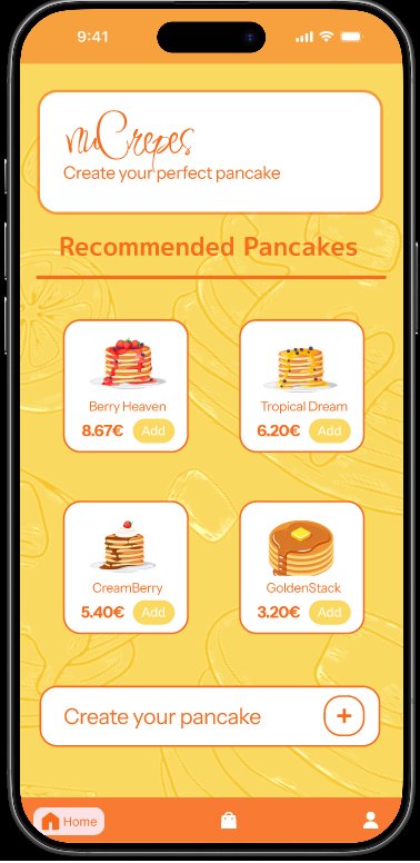
Recommended Combos
Pre-designed pancakes — Berry Heaven, Tropical Dream, CreamBerry, GoldenStack — for users who want speed over customization.
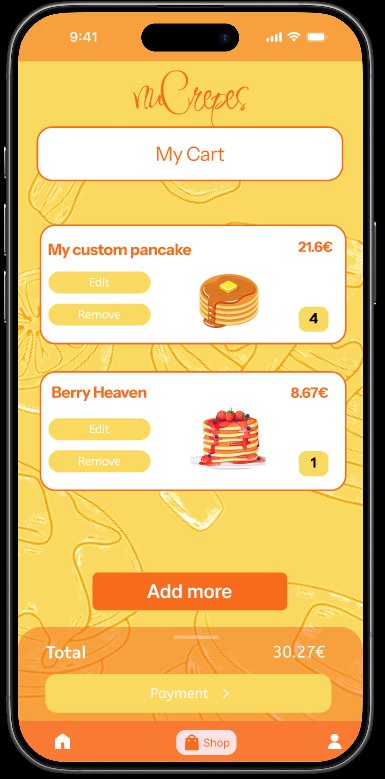
Edit-Friendly Cart
Items in cart can be edited or removed without losing progress. Total recalculates instantly. Single-tap "Payment" button to proceed.
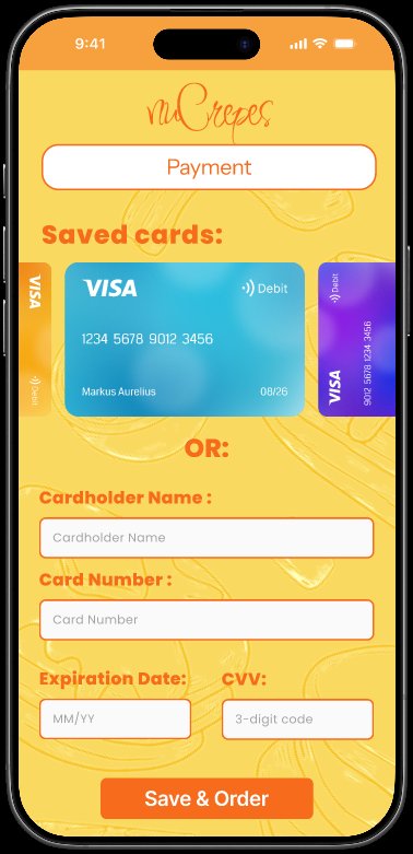
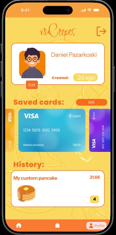
Saved Cards Carousel
Payment screen shows previously saved cards in a swipeable carousel, with option to manually enter a new card. Visual card design (Visa/Mastercard) for instant recognition.
Profile & Order History
User profile with avatar, account age, saved payment methods, and a scrollable order history. Re-order with one tap from history.
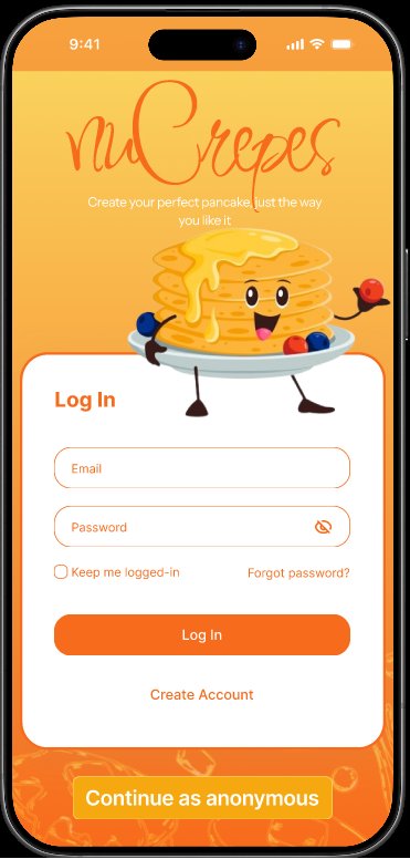
Anonymous Mode
"Continue as anonymous" option on login lets users browse and order without creating an account — reduces signup friction.
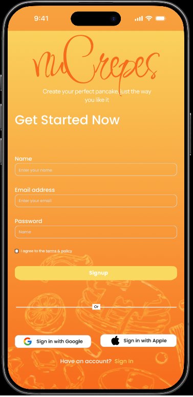
Social Sign-In
Google & Apple sign-in options on the register screen — fast onboarding for users who already have those accounts.
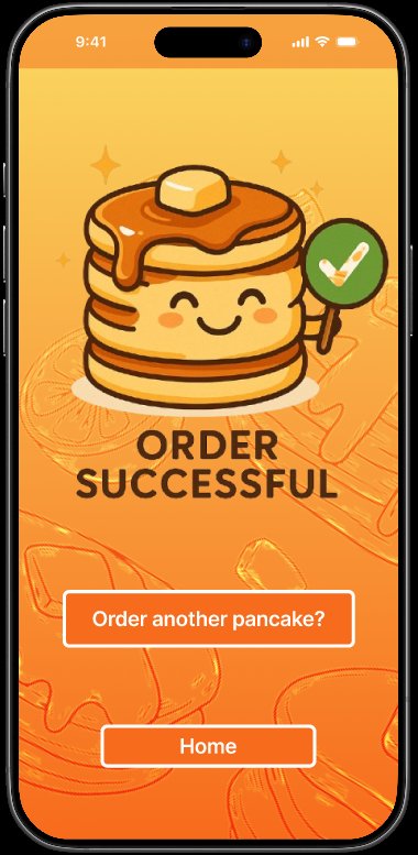
Delightful Confirmation
After successful order, a cute pancake mascot with checkmark celebrates the user. CTAs to order another or return home.
USER FLOW
The flow minimizes decision fatigue: a returning user can go from app open to confirmed order in 4-5 taps using recommended pancakes and a saved card. First-time users have a slightly longer path but with clear visual cues at every step.
DESIGN SYSTEM
COLOR PALETTE
- Primary Orange
#FF6B35 - Warm Yellow BG
#FFCB6B - Cream / Card
#FFF8E7 - Dark Brown Text
#3B1F09 - Accent Coral
#FF8C61 - Success Green
#4CAF50
TYPOGRAPHY
- Brand Logo
Script font - Headings
Sans-serif bold - Body text
Sans-serif regular - Friendly, rounded shapes
- Mix of orange & brown for hierarchy
COMPONENTS
- Rounded white cards
- Pill-shaped CTA buttons
- Checkbox lists for choices
- Bottom navigation bar (Home / Shop / Profile)
- Quantity stepper (+/-)
- Swipeable card carousel
VISUAL STYLE
- Hand-drawn pancake illustrations
- Playful character mascot
- Watermark pattern on backgrounds
- Soft drop shadows for depth
- Vibrant fruit imagery for items
TOOLS & PROCESS
Figma
Entire prototype built in Figma — components, auto-layout, interactive prototyping with smooth transitions between screens.
Auto Layout
Used Figma's auto-layout for responsive cards, lists, and forms. Easy to add/remove items without breaking design.
Component Library
Reusable components for buttons, cards, input fields, and bottom nav — consistent style across all 9 screens.
Custom Illustrations
Pancake illustrations and background patterns sourced and adapted to match the playful brand identity.
DESIGN DECISIONS
Warm orange-yellow palette
Chose orange and yellow because they trigger appetite and feel cozy — perfect for a pancake-ordering app. Pancake-y. Avoided cold or trendy minimalist palettes that wouldn't match a comfort-food experience.
Anonymous mode
Most ordering apps force a signup. Decided to add "Continue as anonymous" because for a casual purchase like a pancake, requiring an account is friction that loses users — they can sign up later if they want history.
Visualized credit cards
Saved cards shown as realistic Visa/Mastercard graphics with last 4 digits — users instantly recognize which card they're picking, vs a boring text list. Tactile and trustworthy.
Cute confirmation mascot
The "Order Successful" screen uses a smiling pancake mascot with a checkmark. Tiny detail but creates an emotional moment — users feel happy at the end of the transaction, increasing brand love and likelihood to return.
Recommended pancakes first
Home screen leads with curated pancakes (Berry Heaven, Tropical Dream) rather than the custom builder. Most users don't want to make decisions — give them a great option first; the builder is a step deeper for power users.